Castle or Clyde? Picking Sides in the Edinburgh vs Glasgow Print Debate
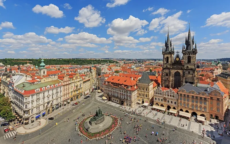
Photo: A.Savin, FAL, via Wikimedia Commons
This is not a balanced piece, and let's be honest about that from the start. Edinburgh and Glasgow have been gently needling each other for roughly two centuries, and the print world is simply the latest arena. What follows is a completely unscientific comparison of their signature motifs, their colour palettes and the sort of person who hangs each one. There is no winner. There is, however, a right answer for you.
Edinburgh: the city that already looks like a print
There's a reason Edinburgh sells so well as wall art, and it's not laziness. The place is composed. The Castle on its crag, the Old Town closes stacked like drawers, Victoria Street curving downhill in those improbable colours, Calton Hill's monuments silhouetted at dusk. Point a camera anywhere and you've got a composition.
The catch is that everyone knows it. An Edinburgh print has to work harder to feel like yours rather than a hotel lobby's. The ones that succeed tend to be specific — a particular close, a particular church spire, a rain-soaked view from Arthur's Seat that nobody else bothered to walk up for.
The palette: slate grey, wet sandstone, pale blue light, the dark green of the Castle rock. Cool, restrained, slightly melancholic. It gets on beautifully with a white wall and a wooden floor and absolutely sulks in a warm beige room.
The mood: heritage, literature, a bit pleased with itself. Which, fair enough — it's earned it.
Glasgow: the city that won't pose
Glasgow is a harder sell and a better hang. The Clyde with the Finnieston Crane, Kelvingrove's red sandstone, the Barrowlands sign, the Kingston Bridge at rush hour, tenements with their washing out. It's a city that looks best slightly off-guard.
This is where Glasgow prints win: they feel lived in rather than visited. There's grit in them, and grit is what makes a room feel like somebody actually lives there. A Glasgow print above a desk says something. An Edinburgh print above a desk says something too, but it's usually said in a slightly posher voice.
The palette: red sandstone, industrial green, orange streetlight, the flat grey-silver of the river. Warmer and louder than Edinburgh's. It holds up in rooms with a bit of clutter, and it survives a dark wall.
The mood: dry humour, civic pride, a chip on the shoulder worn like a brooch.
Head to head, motif by motif
- Skyline: Edinburgh Castle vs the Finnieston Crane. Both are instantly recognisable; the crane is the more interesting shape.
- Street scene: the Royal Mile vs Ashton Lane. The Royal Mile is more iconic, Ashton Lane is more fun.
- Green space: Arthur's Seat vs Kelvingrove Park. Arthur's Seat wins on drama, no argument.
- Water: Leith vs the Clyde. Leith is friendlier, the Clyde is grander.
- Night view: Calton Hill vs the Squinty Bridge lit up. Honestly, a tie, and both make excellent prints.
What the makers say
Printmakers I've chatted to at fairs tend to say the same two things. First, Edinburgh outsells Glasgow with visitors and gifts, by a wide margin. Second, Glasgow outsells Edinburgh with people who actually live in Scotland. Repeat buyers, they reckon, want the city they know rather than the city on the shortbread tin.
One printmaker put it neatly: Edinburgh is what people buy for their mum, Glasgow is what they buy for themselves. A bit of a generalisation. Also, in my experience, broadly true.
The colour argument nobody warns you about
If you're buying blind online, this is the bit that catches people out. Edinburgh prints are cool-toned, and cool-toned prints go cold under warm bulbs. If your living room is all lamps and wooden furniture and a slightly yellow wall, a slate-and-pale-blue Edinburgh print can look washed out in a way that surprises you.
Glasgow prints, with all that red sandstone and streetlight orange, are far more forgiving in a warm room. They also tend to hold their own in a rented flat with questionable magnolia everywhere, which is worth more than it sounds.
Our advice either way: check the print under both daylight and lamplight before you commit, or buy from a seller who shows both.
How to choose if you're from neither
Most buyers aren't loyalists. They've had a good weekend in one, a wedding in the other, a flatmate from Paisley. So choose by memory, not by reputation.
- Bought your first proper coat on Princes Street? Edinburgh.
- Queued for a gig at the Barrowlands in the rain? Glasgow, obviously.
- Went to university in one and met your partner in the other? Buy both. Gallery wall. Keep the peace.
- Never been to either? Then pick the one that suits your room's light and stop overthinking it. It's a print, not a passport.
The verdict nobody asked for
Edinburgh makes the better gift. Glasgow makes the better wall. Edinburgh gives you instant recognition and a safe bet for a housewarming; Glasgow gives you something with a bit of personality that people ask about.
But here's the thing — this is a rivalry conducted mostly in pubs and, increasingly, in print listings. Whichever side you land on, you're buying a piece of a city someone cared enough to draw. That's a decent thing to hang, whatever your accent.