Tartan Without the Tin: How to Pick Scottish Heritage Prints That Look Genuinely Modern

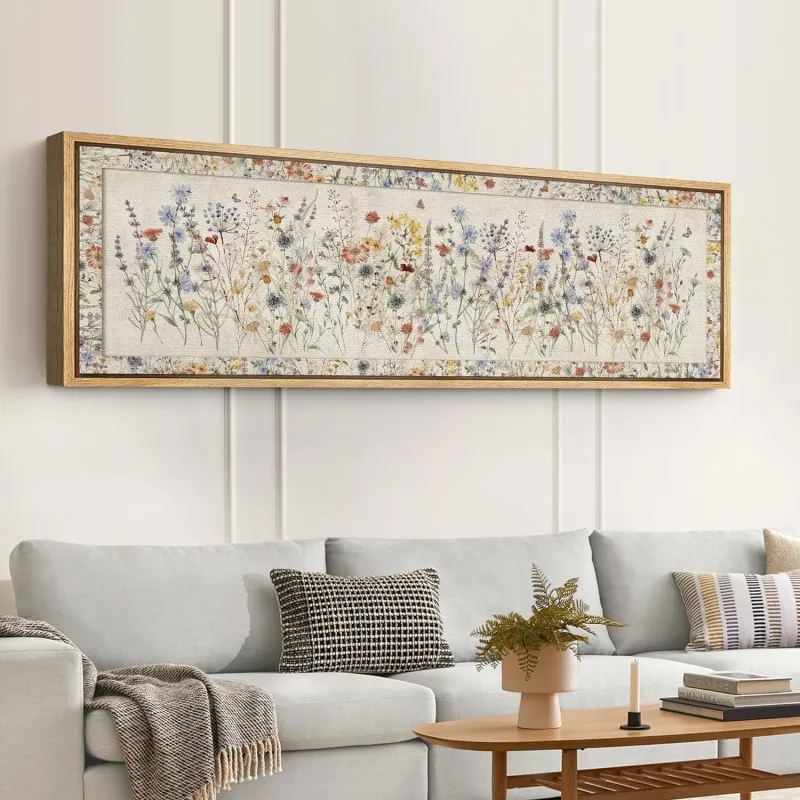
Photo: modern minimalist Scottish thistle screenprint framed on light living room wall, via www.navsource.net
There is a certain kind of Scottish print that turns up in every gift shop between the Royal Mile and Loch Ness: a glossy thistle, a soft-focus Highland cow, and a shortbread tin to match. Nobody is attacking the shortbread. The trouble is that a handful of images have been reproduced so relentlessly that tartan, thistle and heather now read as souvenir rather than art — which is a pity, because the raw material underneath is genuinely strong. Scotland's visual vocabulary is centuries deep. It just needs editing.
So, an opinion, since that's what this column is for: heritage motifs are not the problem. Lazy reproduction is. You can hang a thistle in a modern flat and have it look deliberate rather than duty-free. The difference is almost never the subject. It's the execution, the scale and what you put next to it.
What separates collected from touristy
Three things, in my experience of looking at a lot of walls.
The first is specificity. Tourist art deals in shorthand: a generic castle, a generic glen, a kilted figure with no face. Good design deals in particulars — an identifiable stretch of coastline, a named close off the High Street, the actual shape of a hillside you could point to on a map. When a print commits to a real place, it stops being decoration and starts being a small piece of record-keeping.
The second is restraint. Two colours, three at most. A single line doing the work of a hundred. Compare an over-saturated, airbrushed sunset with a two-colour screenprint of the same view and the difference is obvious within a second.
The third is editing. Heritage design that works takes one element and commits to it. Heritage design that doesn't takes six — tartan, thistle, stag, saltire, Celtic knot, faux-Victorian script — and stacks them until the whole thing curdles into a tea towel.
Four signals of a modern heritage print
- Abstraction over illustration. A thistle reduced to geometry. Tartan reset as an oversized grid or a pixelated pattern. A standing stone rendered as a single confident mark.
- Honest materials. Screenprint, risograph, linocut and letterpress all leave a texture you can see across a room. A flat digital reproduction of a flat digital original rarely has that pull.
- Modern colour. Muted, dusty, or unexpectedly bold — think rust and chalk, or a bright ochre against grey. Anything that isn't sepia plus a bit of heather.
- Typography with a light touch. Place names set properly, in a typeface designed after 1960. No fake calligraphy, no crests, no borders pretending to be old.
Motifs worth a second look
Tartan is the easiest of the lot to make modern, because pattern is already fashionable. Treat it as a grid rather than as fabric: a full-bleed sett, a cropped section, or a repeat scaled up until it becomes abstract. It sits beautifully beside plain ceramics and mid-century furniture — it reads as textile history rather than as a kilt.
The thistle works when it's treated as a shape. One stem, no shading, printed large. Also good: the seed head rather than the flower.
Ceilidh and dance imagery is having a quiet moment. Loose figure drawings and movement studies feel lively and personal without any tartan at all, and they suit hallways and kitchens where something with energy is welcome.
Glasgow School geometry — the rose, the ladder-back chair, the tall thin window — is practically designed for contemporary interiors. It's a hundred-plus years old and still looks like it arrived last month.
Coastline and map work does the heritage job subtly. A contour map of a glen, a line drawing of a harbour wall, a bothy in three lines: these are Scottish without announcing themselves, which is often what people actually want when they say they'd like something a bit Scottish but not too much.
Styling so heritage reads as modern
A few rules of thumb that hold up across most UK homes, whether it's a tenement flat, a 1930s semi or a new-build with very square rooms.
- Simpler frames than you think. Thin black, pale oak or plain white. No ornate gilt, no hessian mounts, no distressed paint effects. The frame should be the quietest thing on the wall.
- Give it air. One heritage piece per wall, or one within a gallery cluster. Crowd it and the room starts to feel themed.
- Mix eras deliberately. A screenprinted thistle above a mid-century sideboard, or a tartan grid next to a plain plaster lamp, immediately pulls the print away from gift-shop territory.
- Borrow one colour. Pick a single tone out of the print — rust, ochre, deep green — and repeat it in a cushion, a throw or a lampshade. It makes the print look chosen rather than inherited.
- Don't stop at the saltire. If every object in the room is Scottish, the effect is a visitor centre. One strong piece does more.
The budget question
Heritage design doesn't have to mean expensive. Open-edition A4 and A3 prints from Scottish studios and independent makers sit comfortably in the £15 to £40 range, and a plain off-the-shelf frame adds very little. Two or three prints bought over a year or two will always look better than six bought in one panicked afternoon — and they'll tell a better story.
The shortbread-tin test
Here's the question I'd ask before buying anything with a thistle on it: if I took this out of the tin, out of the gift shop, out of the context of a weekend away — would I still hang it?
If the answer is yes, you've found a piece of design rather than a souvenir. That's the whole difference, and it's almost always visible from across the room.