Forty-Five Quid, Three Frames, One Hallway: The Scottish Print Plan That Does the Introductions
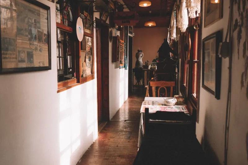
There is a particular kind of Scottish hallway that tells you everything before you have taken your coat off. Not the decor, necessarily — more the atmosphere. A tenement close with a strip of light under the door, a Victorian terrace with a radiator that clanks like a distant piper, a new-build where the walls are still deciding what they want to be. The hallway is the handshake of the house. And yet it is usually the last wall anyone bothers to dress.
In 2026, with print prices all over the place and framing costs doing their own impression of a Highland wind, the hallway is actually the smartest place to start. It is small, it is low-stakes, and it is the first thing guests see. You do not need a gallery wall. You need three prints, three cheap frames and a plan that costs less than a decent night out.
Why the hallway deserves the first £45
The hallway is a high-traffic, low-sitting area. Nobody lingers there long enough to get bored of a print, but everybody passes it several times a day. That makes it the ideal testing ground for a Scottish print set you might later move to the living room. If a landscape feels too moody above the shoe rack, you will know before you commit it to the wall above the sofa.
It is also the wall that does the most emotional work. A delivery driver, a date, a plumber, your mother — they all form an impression in the time it takes to wipe their feet. A considered trio of prints says somebody lives here and has opinions, without shouting about it. In a rental, it is the one wall you can usually justify making your own, because it is the wall you see every single day.
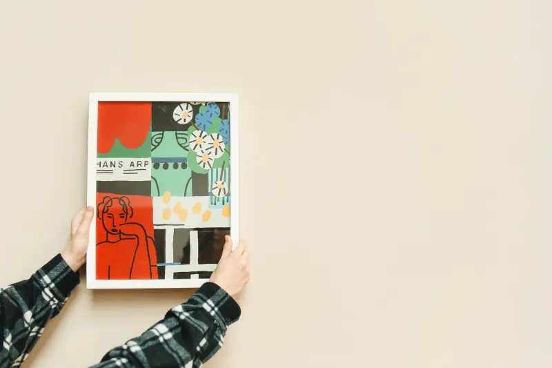
The budget matters. A £45 plan is not about being stingy; it is about proving that a hallway can look intentional without looking expensive. Three A4 prints at roughly £12 each comes to £36. Three charity-shop frames at £3 each comes to £9. That is £45 exactly, before you raid the drawer for picture hooks. If you already own frames, even better — spend the difference on a fourth print or a better frame for the one that matters most.
Choosing three prints that get on with each other
A hallway is a narrow, often badly lit space. Clutter shows up fast. So the temptation is to go minimal — and the risk is that minimal turns into boring. The trick is variety within a tight colour story.
Start with a landscape. Something soft and horizontal: a muted glen, a shoreline in the Hebrides, a field with a thin line of trees. Avoid the over-saturated shortbread-tin look. You want something that reads as a place, not a postcard.
Then add a city print. Glasgow or Edinburgh, a close or a bridge, a tenement roofline or a harbour. This gives the hallway a bit of grit and a sense of actual life. If the landscape is the deep breath, the city print is the conversation.
Finally, a heritage design. Not tartan, not a stag’s head, not a declaration of clan loyalty. Think a simple map, a line drawing of a fishing creel, a tile-inspired pattern, a quiet nod to Scottish craft. Heritage prints work best in a hallway when they look like they were chosen rather than inherited.
Keep the palette close. Two cool prints and one warm one, or three that share a grey-green undertone. The subject matter can wander; the colours should not.
The layout that survives a narrow hall
Most hallway advice assumes you have a wide, well-lit corridor. Most of us do not. We have a passage barely wide enough for two people to pass, a radiator, a coat hook, a door that opens the wrong way.
In a narrow hall, hang the prints in a vertical column rather than a row. Three frames stacked with roughly 5–7cm between them will fit almost anywhere and draw the eye upwards, which makes the ceiling feel higher and the floor feel less crowded. Centre the middle print at about 1.5 metres from the floor — roughly eye level for most adults — and work up and down from there. If you have a dado rail, keep the bottom frame above it rather than straddling it.
If the hallway is wider, a single horizontal row at eye level works well, especially with smaller A5 prints. Avoid wrapping prints around a corner; it looks like you ran out of wall. Keep them on one flat surface so they read as a set.
Use paper templates before you commit. Cut out rectangles the size of your frames, stick them up with low-tack tape and live with them for a day. You will immediately see if the spacing is off, if the bottom print is too low, or if the whole thing is fighting the light switch. It is the cheapest design tool you own.
Frames: plain, thin and second-hand
A hallway is not the place for ornate gold. Thin black, pale oak or simple white frames will make affordable prints look far more expensive than they are. Charity shops and car boot sales are full of them. Buy three that are similar in depth and colour, even if the finishes differ slightly. If one is scuffed, a quick coat of matte paint — probably already in the cupboard — will unify them.
Perspex rather than glass is worth considering in a busy hallway, especially if you have children or a dog with a wagging tail. It is lighter, safer and cheaper to replace. And please, measure the print before you buy the frame. A4 is not always A4 once a mount is involved.
The housewarming gift that actually gets hung
A framed set of three Scottish prints makes a genuinely useful housewarming gift, because it solves a problem most new homeowners have not got round to: the hallway. It is portable, it is personal and it does not need to match a sofa. Add a small handwritten note with a suggested layout — ‘column of three, 5cm apart, middle one at eye level’ — and you have given someone a weekend project that takes twenty minutes and makes the house feel finished.
It also travels well. Unlike a bottle of wine, it will still be there in 2027. Unlike a plant, it will not need watering. And unlike a candle, it will not make the hallway smell of cedarwood and regret.
Treat the hallway as a test gallery
The best thing about a £45 hallway plan is that it is not precious. You can move the prints, swap the order, repaint the frames, take the whole lot down and start again. It is a low-risk way to learn what you actually like on a wall, rather than what looks good in a browser tab.
Start with the first wall guests see. It is the one that will teach you the most.