Landscape, City, Heritage: The Rule of Three That Stops a Scottish Wall Looking Like a Gift Shop
Photo: Uncredited, Public domain, via Wikimedia Commons
You've got a landscape. You've got a city print. Someone gave you a heritage design with a stag on it. Hung together, they look less like a curated wall and more like three strangers waiting for separate buses.
The instinct is to blame the prints. Usually it's not the prints — it's the absence of a system. Mixed-genre walls work when you impose a few boring rules and then let the pictures do whatever they like within them.
Here's the system.
Rule one: one palette, and let it police everything
Before you hang anything, decide on a palette of three colours and stick to it. Not three shades — three actual colours. Something like: sea blue, warm cream, charcoal. Or: rust, off-white, forest green.
Every print on the wall should contain at least two of those three. That's it. That's the whole trick.
This is why landscape, city and heritage can sit together comfortably. A slate-blue Moray coast print, a monochrome Edinburgh skyline and a tartan-inspired geometric all share a blue-and-charcoal spine, so the eye reads them as one family. Swap the skyline for a bright orange sunset city print and the whole wall falls apart.
If you're buying new, start with the palette and shop backwards. It's far easier than falling in love with four prints and trying to square them afterwards.
Rule two: two sizes, maximum
Mixed walls go wrong when every picture is a slightly different size. Three sizes is chaos; five is a jumble sale.
Pick a large and a small. Say A2 and A4, or A3 and A5. Then build combinations from those two only. A big landscape with two small flankers reads as a considered group. Three medium prints in three slightly different dimensions reads as an accident.
One exception: a single oversized anchor print — an A1 landscape — can carry a wall alongside four or five much smaller pieces, because the size difference is so extreme it becomes obviously deliberate.
Rule three: repeat something three times
Your eye wants rhythm. Give it one element that appears exactly three times across the wall and the whole arrangement clicks into place.
Easiest options:
- The same frame. Three identical thin black frames across three different genres. Boring on paper, brilliant on the wall.
- The same mount width. A consistent 5cm cream mount on everything, regardless of frame.
- The same colour. One specific blue appearing in three prints, three times.
- The same shape. Three portrait prints, or three squares, in a row.
Pick one. Don't pick three.
Framing is the cheapest way to make three strangers look related
You can spend £30 on prints and £90 on framing and end up with something that looks twice as expensive as it is. Or the reverse.
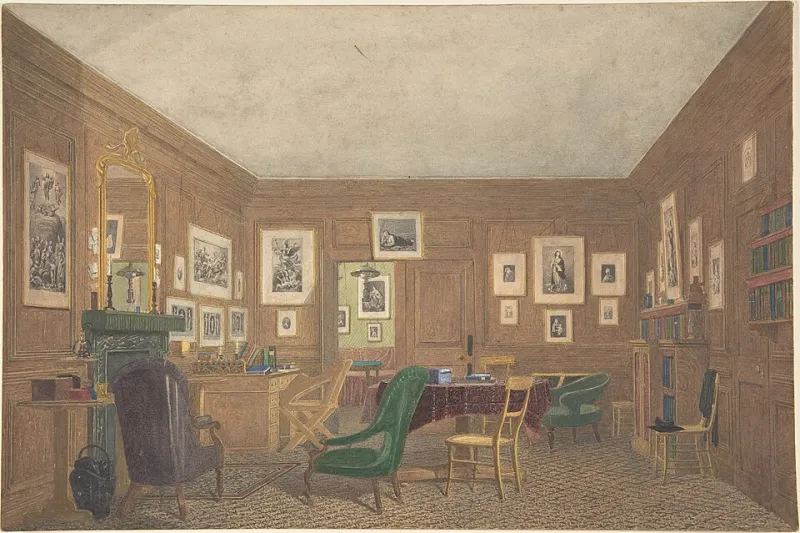
For mixed walls, go uniform on the frames and let the art vary. Slim, matte, natural wood or black — both work, both are cheap, both disappear. Wide ornate frames fight each other and fight the art. Chunky box frames with no mount squash everything inside them.
A word for renters: a set of matching frames from a high-street homeware shop at £12–£20 each is the single best value move here. Then hang with damage-free adhesive strips rated well above the weight of the frame, or use existing picture rails with proper hooks. Command strips will hold a 500g A4 frame happily; they will not hold a 3kg A2 with glass, so check the rating rather than guessing. And never hang glass over a radiator.
Room by room
Hallway. The classic three-in-a-column: a tall portrait landscape (a harbour wall, a woodland path), a city print, a small heritage square. Same frame, same mount, top to bottom. 8–10cm gaps. This is the easiest mixed wall there is and it looks intentional every time.
Living room. One A2 landscape as the anchor, positioned off-centre rather than dead middle, with two A4s to one side — a city print and a heritage print, stacked with a small gap. Keep the two small ones visually lighter than the anchor so it stays in charge.
Bedroom. Two prints only, and make them the calmest ones you own. A soft East Neuk coastal print plus a pale, minimal heritage pattern. Low contrast, low drama, no strong reds. You want to wake up to it, not be startled by it.
Kitchen or dining space. This is where a bolder heritage design can finally earn its keep — tartan-derived checks and geometric patterns work well against tiles and cabinets. Pair with a single graphic city print and keep everything else quiet.
Rented rooms with no nails allowed. Lean, don't hang. A slim picture ledge above a sofa or a sideboard takes three frames of mixed genres beautifully, requires two screws into a wall you're allowed to drill (or none, if it's freestanding), and lets you shuffle the arrangement whenever you get bored. Damage-free strips on the back of each frame stop them sliding.
Gift-friendly combinations that actually work
If you're building a set for someone else, buy in threes and keep to the same rules. A few that land well:
- New home, moved cities. A city print of where they've landed, a landscape of where they came from, and a small heritage piece as the neutral middle. Deeply personal and strangely hard to argue with.
- First flat, tiny budget. Three A4s in identical frames: one landscape, one city, one heritage pattern. Roughly £25–£35 per print, £12–£20 per frame. Looks like £200.
- Wedding or anniversary. A landscape of the coast or glen they were married in, plus a soft heritage pattern and a city print of where they live now. Frame all three identically so the sentiment does the talking.
- The safe one. Two landscapes and a city print, all in the same palette. Nobody has ever been disappointed by this.
The five-minute check before you hang
The night before you put holes in anything, lay the whole arrangement on the floor and look at it from across the room. Squint. If three things jump out at you, you've got three anchors and no hierarchy — remove the loudest one. If nothing stands out at all, you need one bigger piece. If it looks fine squinting, it'll look great on the wall.
Then take a photo on your phone. The camera flattens everything and shows you what's actually competing. It's the least glamorous styling tip going, and it works every time.